盒模型
引用
介绍基础盒模型
在布局文档时,浏览器渲染引擎根据CSS基本盒模型将每个元素视为一个矩形框。CSS决定框的大小、位置和属性(颜色、背景、边框大小等)。
每个盒子由四部分组成:content、padding、border、margin。
When laying out a document, the browser's rendering engine represents each element as a rectangular box according to the standard CSS basic box model. CSS determines the size, position, and properties (color, background, border size, etc.) of these boxes.
Every box is composed of four parts (or areas), defined by their respective edges: the content edge, padding edge, border edge, and margin edge.
视觉格式化模型(Visual formatting model)
Visual formatting model - CSS: Cascading Style Sheets | MDN
在CSS中,视觉格式化模型描述用户如何获取文档树,并且处理和在视觉媒体上显示。
在视觉格式化模型中,文档树中每个元素根据盒模型生成零个或多个盒子。这些盒子的布局受以下因素控制:
- 盒子尺寸和类型
- 定位方案(正常流、浮动、绝对定位)
- 文档树中元素之间的关系
- 外部信息(例如,视口大小、图像的固有尺寸等)
盒子生成
Box generation 是 CSS 视觉格式化模型的一部分,它从文档的元素创建Box。生成的Box有不同的类型,这会影响它们的视觉格式。生成的Box的类型取决于CSS display 属性的值。
CSS获取源文档并将其渲染到画布上。为此,它会生成一个中间结构,盒子树(Box Tree)。它表示所渲染文档的格式结构。Box tree 中每个box代表其在画布上的空间或时间中的对应元素(或伪元素),而Box tree中运行的每个文本同样代表其对应文本节点的内容。
The principal box(主盒子)
当一个元素生成一个或多个盒子时,其中一个是主盒子,它包含Box tree中的后代Box和生成的内容。
一些元素除了主框之外还可以生成附加框,例如display: list-item生成多个框(例如主块框和子标记框)。某些值(例如none或contents)会导致元素和/或其后代根本不生成任何框。
Anonymous boxes(匿名盒子)
当没有可用于匿名框的 HTML 元素时,就会创建匿名盒子。
例如:
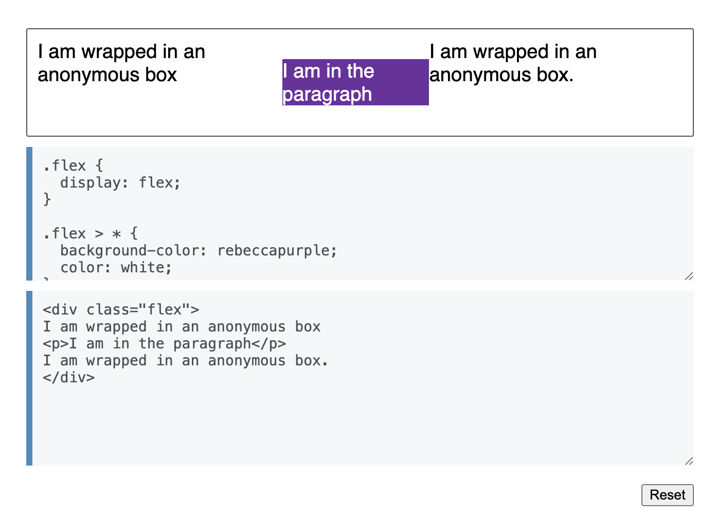
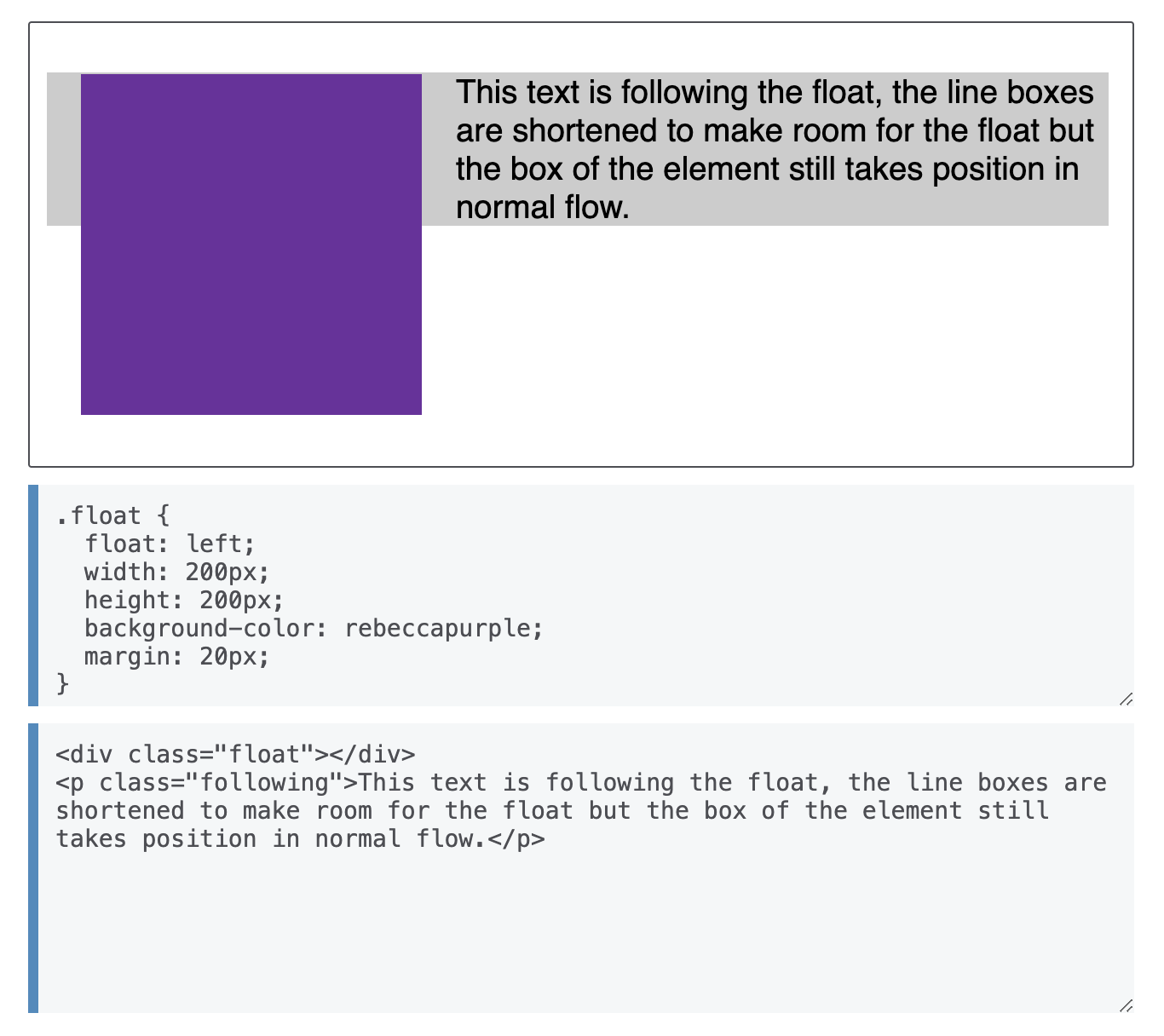
Line boxes(行盒子)
行盒子是包裹每行文本的框。如果您浮动一个项目,然后在其后面跟随一个具有背景颜色的块,您可以看到行框与其包含块之间的差异。
例如:
BFC
Block formatting context - Developer guides | MDN
块格式上下文 (BFC) 是网页视觉 CSS 呈现的一部分。它是块框布局发生以及浮动与其他元素交互的区域。
A block formatting context (BFC) is a part of a visual CSS rendering of a web page. It's the region in which the layout of block boxes occurs and in which floats interact with other elements.
块格式化上下文至少由以下之一创建:
- 文档的根元素 (
<html>)。 - 浮动(
float不是 的元素none)。 - 绝对定位的元素(其中
positionisabsolute或 的元素fixed)。 - 内联块(带有 的元素)。
display: inline-block - 表格单元格(带有 的元素,这是 HTML 表格单元格的默认值)。
display: table-cell - 表格标题(带有 的元素,这是 HTML 表格标题的默认设置)。
display: table-caption - 由带有、、、、(分别是 HTML 表格、表格行、表格主体、表格标题和表格页脚的默认值)或 的元素隐式创建的匿名表格单元格。
display: table``table-row``table-row-group``table-header-group``table-footer-group``inline-table - 块元素的
overflow值不是visible和clip。 display: flow-root。- 带有、、 或 的元素。
contain: layout``content``paint - 如果Flex 项目本身既不是Flex容器,也不是网格容器,也不是表格容器,则 Flex 项目(带有或 的元素的直接子元素) 。
display: flex``inline-flex - 网格项(带有或 的元素的直接子元素),如果它们本身既不是Flex 容器,也不是网格容器,也不是表格容器。
display: grid``inline-grid - 多列容器(其中
column-count或column-width不是 的元素auto,包括带有 的元素column-count: 1)。 column-span: all应该始终创建一个新的格式化上下文,即使column-span: all元素不包含在 multicol 容器中(规范更改、Chrome bug)。
格式化上下文会影响布局,但通常,我们会创建一个新的块格式化上下文来定位和清除浮动,而不是更改布局,因为建立新块格式化上下文的元素将:
- 包含内部浮动。
- 排除外部浮动。
- 抑制边距塌陷。
注意:Flex/Grid 容器(
display:flex/grid/inline-flex/inline-grid)建立一个新的 Flex/Grid 格式化上下文,除了布局之外,它与块格式化上下文类似。Flex/grid 容器内没有可用的浮动子项,但排除外部浮动并抑制边距折叠仍然有效。
例子
包含内部浮动
使浮动内容和旁边的内容具有相同的高度。
让我们看一下其中的几个,以便了解创建新 BFC 的效果。
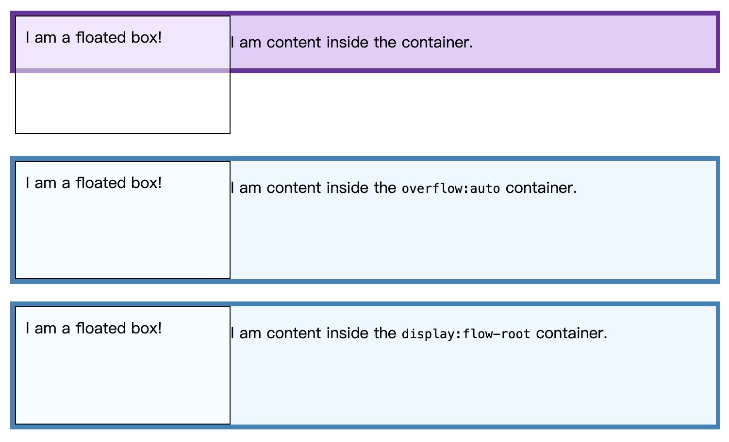
在下面的示例中,我们在 a 内有一个应用了 a 的浮动<div>元素border。其内容<div>与浮动元素一起浮动。由于浮动的内容比它旁边的内容高,所以 now 的边框<div>穿过浮动。正如流入和流出流元素指南中所解释的,浮动已从流中取出,因此 和background只border包含<div>内容而不包含浮动。
使用overflow: auto
设置或设置除创建的包含浮点的新 BFCoverflow: auto的初始值之外的其他值。overflow: visible我们<div>现在成为布局内的迷你布局。任何子元素都将包含在其中。
使用创建新的 BFC 的问题overflow在于,该overflow属性旨在告诉浏览器您要如何处理溢出的内容。在某些情况下,当您纯粹使用此属性来创建 BFC 时,您会发现出现不需要的滚动条或剪切阴影。此外,对于未来的开发人员来说,它可能不可读,因为您用于overflow此目的的原因可能并不明显。如果您使用overflow,最好对代码进行注释以进行解释。
使用display: flow-root
的新值display让我们可以创建一个新的 BFC,而不会产生任何其他潜在问题的副作用。display: flow-root在包含块上使用会创建一个新的 BFC 。
使用display: flow-root;on 时<div>,该容器内的所有内容都会参与该容器的块格式化上下文,并且浮动不会从元素的底部伸出。
flow-root当您了解自己正在创建一些行为类似于root元素(浏览器中的元素)的东西时,值名称就有意义了<html>,因为它如何为其中的流布局创建新的上下文。
<section>
<div class="box">
<div class="float">I am a floated box!</div>
<p>I am content inside the container.</p>
</div>
</section>
<section>
<div class="box" style="overflow:auto">
<div class="float">I am a floated box!</div>
<p>I am content inside the <code>overflow:auto</code> container.</p>
</div>
</section>
<section>
<div class="box" style="display:flow-root">
<div class="float">I am a floated box!</div>
<p>I am content inside the <code>display:flow-root</code> container.</p>
</div>
</section>
section {
height: 150px;
}.box {
background-color: rgb(224 206 247);
border: 5px solid rebeccapurple;
}.box[style] {
background-color: aliceblue;
border: 5px solid steelblue;
}.float {
float: left;
width: 200px;
height: 100px;
background-color: rgb(255 255 255 / 50%);
border: 1px solid black;
padding: 10px;
}
排除外部浮动
在下面的示例中,我们使用display:flow-root和 float 来实现双列布局。我们之所以能够做到这一点,是因为正常流程中建立新 BFC 的元素不会与元素本身位于同一块格式化上下文中的任何浮动的边距框重叠。
<section>
<div class="float">Try to resize this outer float</div>
<div class="box"><p>Normal</p></div>
</section>
<section>
<div class="float">Try to resize this outer float</div>
<div class="box" style="display:flow-root">
<p><code>display:flow-root</code></p>
</div>
</section>
section {
height: 150px;
}.box {
background-color: rgb(224 206 247);
border: 5px solid rebeccapurple;
}.box[style] {
background-color: aliceblue;
border: 5px solid steelblue;
}.float {
float: left;
overflow: hidden; /* required by resize:both */
resize: both;
margin-right: 25px;
width: 200px;
height: 100px;
background-color: rgb(255 255 255 / 75%);
border: 1px solid black;
padding: 10px;
}
在这种情况下,我们不必指定右侧 div 的宽度,而不是宽度为 <percentage> 的内联块。
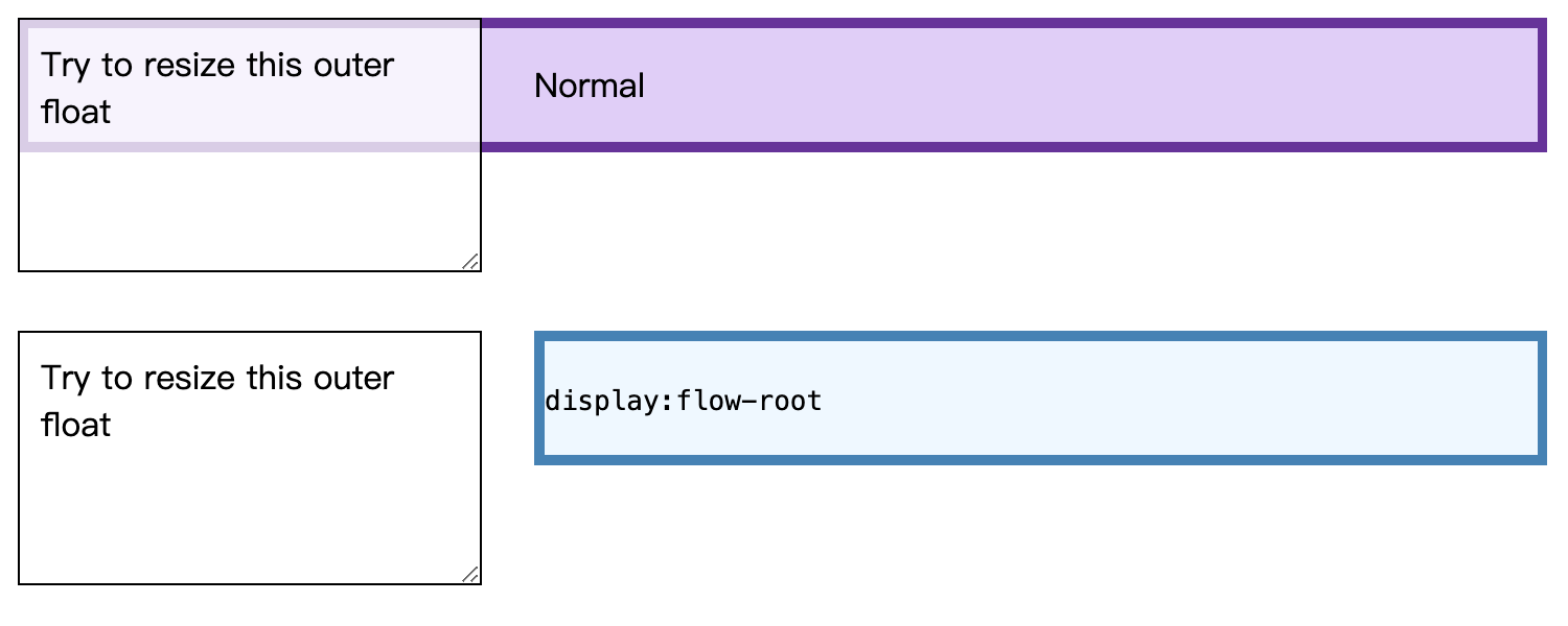
请注意,flexbox 是在现代 CSS 中实现多列布局的更有效方法。
防止边距塌陷
您可以创建一个新的 BFC 以避免两个相邻元素之间的边距折叠。
边距折叠示例
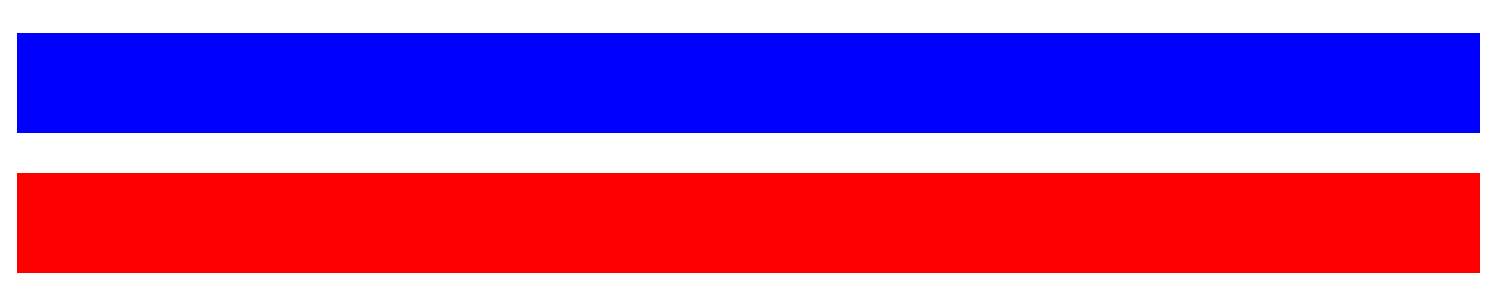
在此示例中,我们有两个相邻<div>元素,每个元素的垂直边距为10px。由于边距折叠,它们之间的垂直间隙为 10 像素,而不是我们预期的 20 像素。
<div class="blue"></div>
<div class="red"></div>
.blue,
.red {
height: 50px;
margin: 10px 0;
}
.blue {
background: blue;
}
.red {
background: red;
}

防止边距塌陷
在此示例中,我们将第二个包裹<div>在外部,以创建一个新的 BFC 并防止边距折叠。
<div class="blue"></div>
<div class="outer">
<div class="red"></div>
</div>
.blue,
.red {
height: 50px;
margin: 10px 0;
}
.blue {
background: blue;
}
.red {
background: red;
}
.outer {
overflow: hidden;
background: transparent;
}